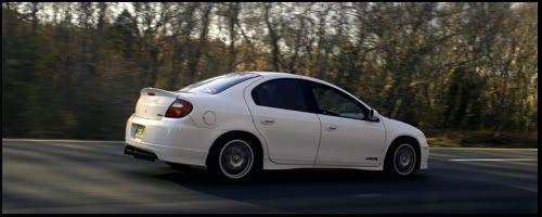
Big thanks to Stephen Wiggins AKA MantaZ for this awesome sig!!!!!
He wanted me to post it, because he ran out of posts for the month.
Heres the original

Anyways heres the finished product.


Portage, MI
AMAZING.
Wow , that looks really good.

The fact that theres nothing behind the front tire (inbetween that and the body) is really bothering me.

look hot ryan, the headlights need to be more tooned tho.

Looks excellent. Only thing I think it needs is a little more depth in the center hole in the bumper, since in the original you can see it's dark red and then fades to the black hole section.
 Toon Gallery
 |
Sig Gallery |
MySpace Page
like said...front bumper needs depth in the hole and the sideskirt is 2-Dimensional?

Got some posts now!
JBoDiED wrote:The fact that theres nothing behind the front tire (inbetween that and the body) is really bothering me.
I didnt really notice that till u pointed that out.. I'll have to remember to make sure there is something back there in future toon if they have the same prob..
OneBadZ24 wrote:look hot ryan, the headlights need to be more tooned tho.
In a post in progress i mentioned i would use the original headlights and windows for a different look.. Ryans headlights i tried tooning many times but to follow the reflection i had to draw the vertical lines, then when done it was to much detail, so i would erase the vertical lines and it looked like it was missing stuff... im gonna practice on them a lil more see what i can come up with, i might draw the vertical lines and fade em out towards the ends..
Heather - anghellic wrote:Looks excellent. Only thing I think it needs is a little more depth in the center hole in the bumper, since in the original you can see it's dark red and then fades to the black hole section.
That is what happens when u do work spread out, i did the body one day and didnt get it finished, then like 2 days later i went back to work on it and forgot where i was at so i just started on the wheels and it must have slipped by.. Thanks for pointing that out
The Other Matt wrote:like said...front bumper needs depth in the hole and the sideskirt is 2-Dimensional?
Like i said above i didnt realize the missing stuff behind the sideskirt

How do u think it looks other than that?
thanks to everyone for the compliments and comments, I will definatly remember them in the next toon i do. This was the first toon i did going with a certain style... The past 2(GrillRD and Euric Dinkins) were me more learning Photoshop and trying to get the tooning down, mainly the tracing.. Once again thanks to z2fst4u for helping me out with certain things.


Looks good! Needs some touching up to do then its perfect!
Good job Stephen!
- Darren

 ontariocavs.com -||- phewes.snowpants.org -||- zukiworld.com


