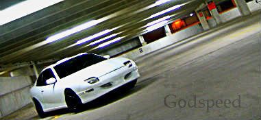
i been working on and off this for weeks *mostly when i get bored* i still got alot to go


looks like you're off to a great start!!

looks good technically
but it looks liek ur not using the right color range for light/dark
i believe looneytuner made a tut on how to do it
The biggest hole, is the illusion of invulnerability.

:::
Creative Draft Image Manipulation Forum:::
Nathaniel O'Flaherty wrote:looks good technically
but it looks liek ur not using the right color range for light/dark
i believe looneytuner made a tut on how to do it
i'm going by the colors of the car its self thats why it looks like that. but like i said i not even close to being done.


