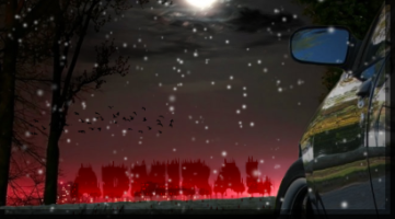
coming along nice? or needs something else?


Would have been better without the license plate. Where is the other wiper?
Aside from that, it looks damm good.
 Rest In Peace, Saint.
Shadow, please come home, I miss you.
Alexis wrote:Would have been better without the license plate. Where is the other wiper?
Aside from that, it looks damm good.
x2 but looks good thou
RIP JESSE GERARD.....Youll always be in my thoughts and prayers...


It's got a liscence plate because my car does

and I don't have any pics of the front end without it. Forgot to draw the other wiper in too hehe..


I don't know if you noticed this but uhh...
your missing the wheels!!
j/k man it looks good so far, you should get rid of the Lplate though, it would look so much better, or least change the color. (of the plate)

Ok, good, I was afraid the car had that one wiper mod.
 Rest In Peace, Saint.
Shadow, please come home, I miss you.
Drivers side mirror looks a lil rough. But other than what else has been mentioned it looks great. Good work.

Thanks for the criticisms, yeah the Jersey plate has always been butt ugly. After trying to get it to work I've decided to freehand the rest of the front end without the plate later.. when I've got time.
@Alexis - Yeah, sometimes when you start drawing all the little details something is bound to get left out

.
@bh04 - Everything from the hood and drivers side fender back hasn't been shaded/highlighted completely.
Heres a try at the plate..just before I decided to toss it


why dont u just remove the plate? i had done that on killerbee's toon.. before i started tooning i just found anotehr pic in similar angle. cut out the grille part i needed and left it.. didnt need to match the color or anything.. just used teh lines to draw on..
also as u do more ull notice lil things to leave out to make ur rendering look cleaner like the wipers,handles,locks,gas door, antennas.. i never put them in my toons or renders cuz i think it looks cleaner but thats just personal pref. but if i have someone asking for those thing in it ill put them in.. also if i were u id do the interior.. makes a big diff in the final overall look of the drawing

Heres another try at that plate deal, its being a p.i.t.a. since I used my stock photo to get an outline and freehanded the rest with a path tool. I just can't get any other pics for reference with a similar bumper and angle. The angles are close..but I think some shading will fix it.


what on earth is outside the bumper?
 Rest In Peace, Saint.
Shadow, please come home, I miss you.
overpray from the airbrush tool

It'll get cleaned up when I'm happy with the design.

although..I could have run over a smurph

I think you did in a smurf.
 Rest In Peace, Saint.
Shadow, please come home, I miss you.
wow it kinda looks 3Dish good job

are ya done yet?? i wanna see this thing finished


