A few things:
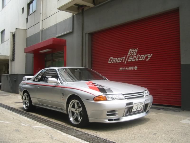
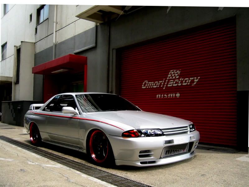
1) take your time on your outlines. Some of your wheel openings look jagged in them. If you're not using it, I would highly recommend using the polygon lasso select tool, and zoom in when you're using it.
2) on the eyelids, you want to add some shaddow under it to make it look more believable.
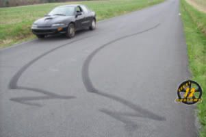
3) (This takes some playing with before you'll likely get the hang of it): play with overlapping layers to keep things where they belong. For example, in your first one, there's an obvious broken line right in the middle of the picture. Placing the front car on another layer and sliding the background down behind it would have avoided this. Also, the front wheel in the second one should still be in front of the door because it's turned out, but it's cut off by the quarter panel.
Hope these tips help.

i just out line the wheel wells and around the top of the picture to lower....and ive been doing these with the laptop mouse pad..... i know their not perfect and i just noticed the wheel on the second one the 2 red mitsubishis.....thanks for the advice tho i appreciate it
