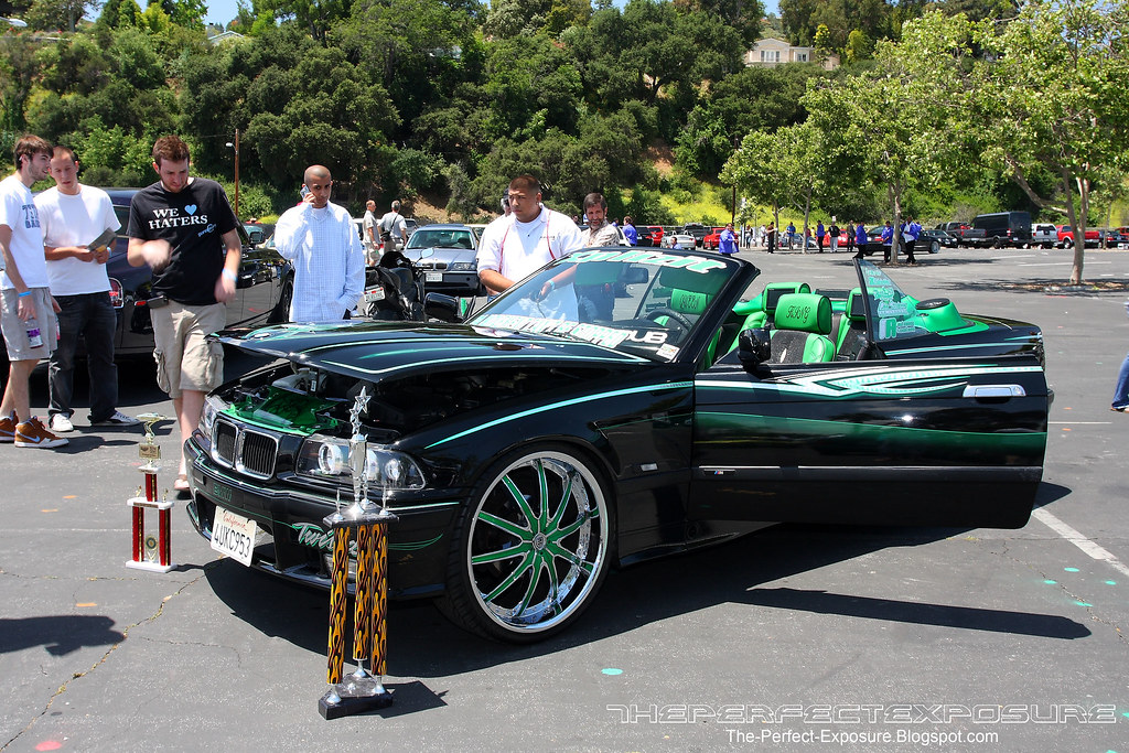
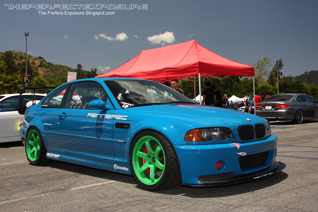
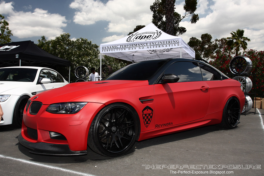
man the first one makes me sick at my stomach to look at, how could someone do such a thing to a nice car like that? the graphics are tasteless and the interior looks cheap and doesn't flow with the ellegance that is a bmw. and are those screens in the front of the rear headrests?

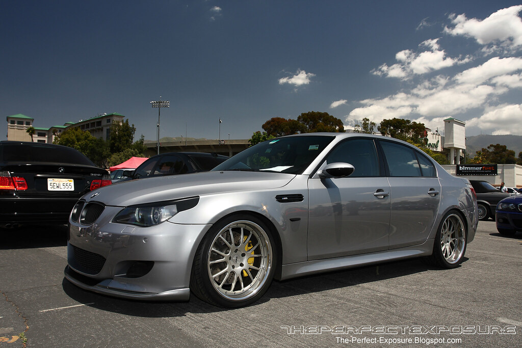
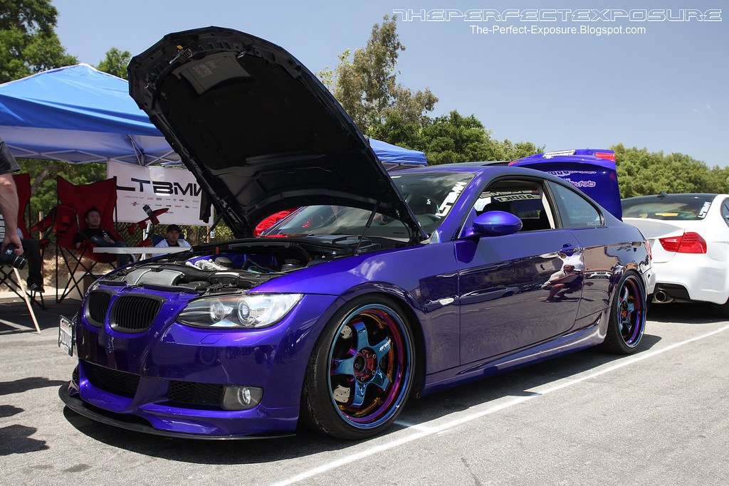
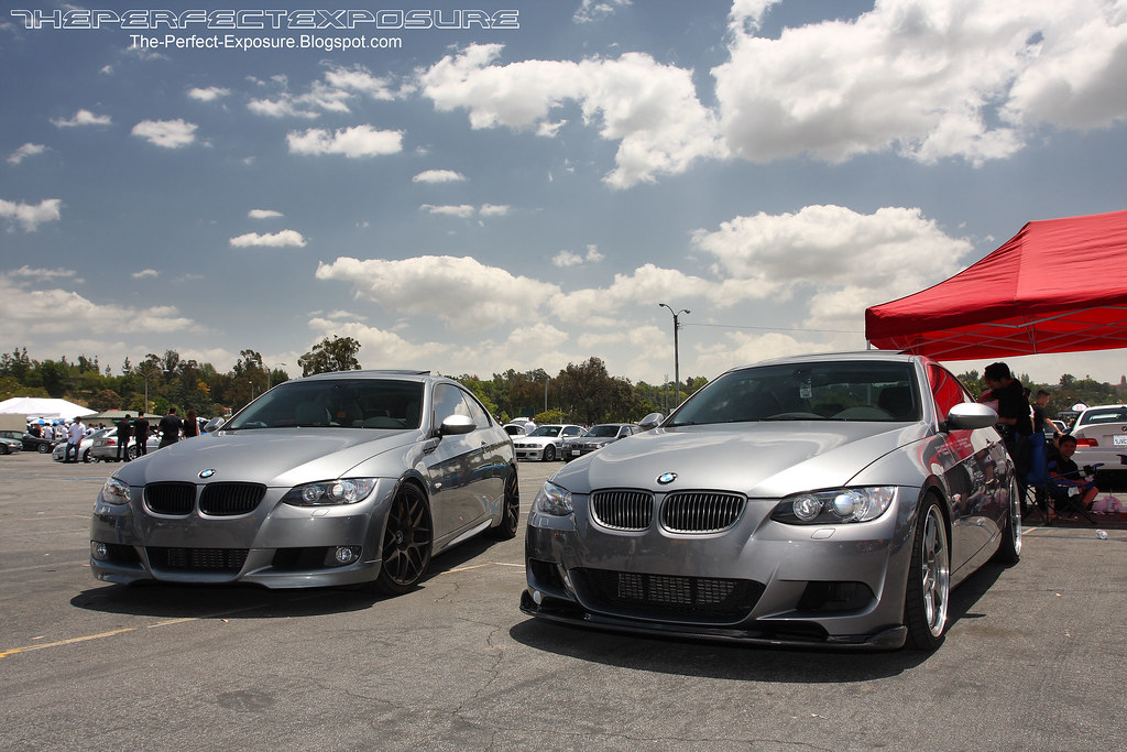
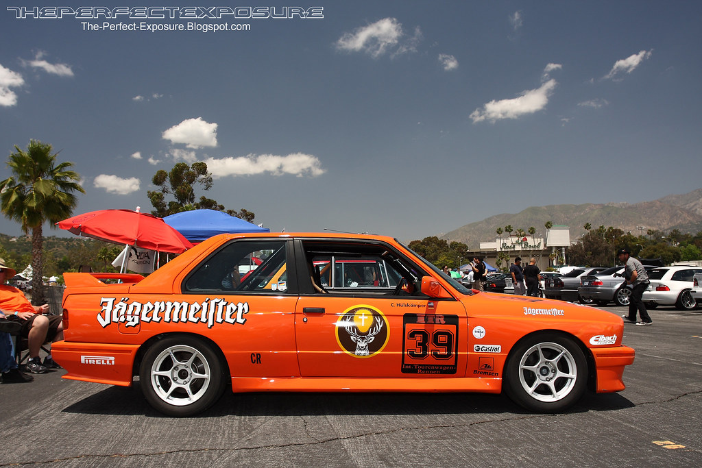
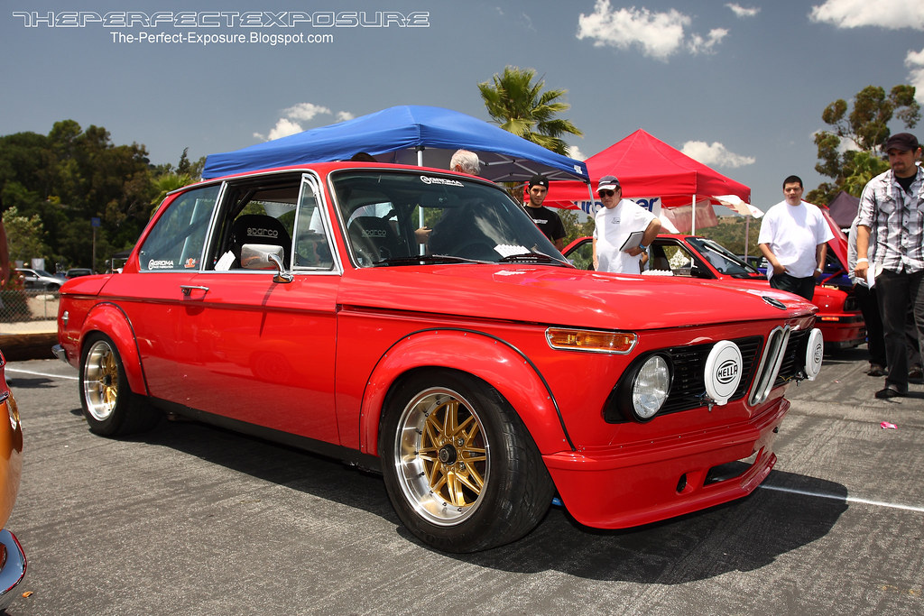
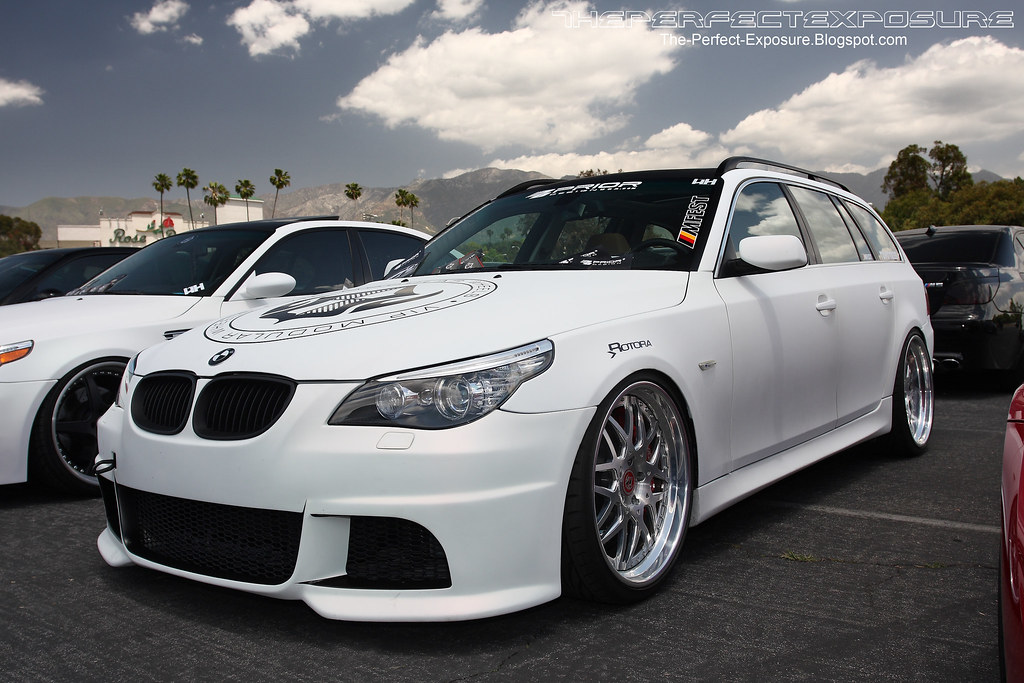
the last 2 pics. :beatoff:

Great pics as usual man, cars are hoooot
~2014 New Z under the knife, same heart different body~
______________________
WHITECAVY no more
2012 numbers - 4SPD AUTOMATIC!!
328 HP
306 TQ
WHITECAVY wrote:Great pics as usual man, cars are hoooot
RIP JESSE GERARD.....Youll always be in my thoughts and prayers...


I'm a fan of #3 and IDK why. lol

name of paint for #9? i think i've fallen in love with that color

www.driftnamiperformance.com
The only one that even kind of catches my eye (in a good way) is the 2002 in Pic #7. The others are either ugly or bland.

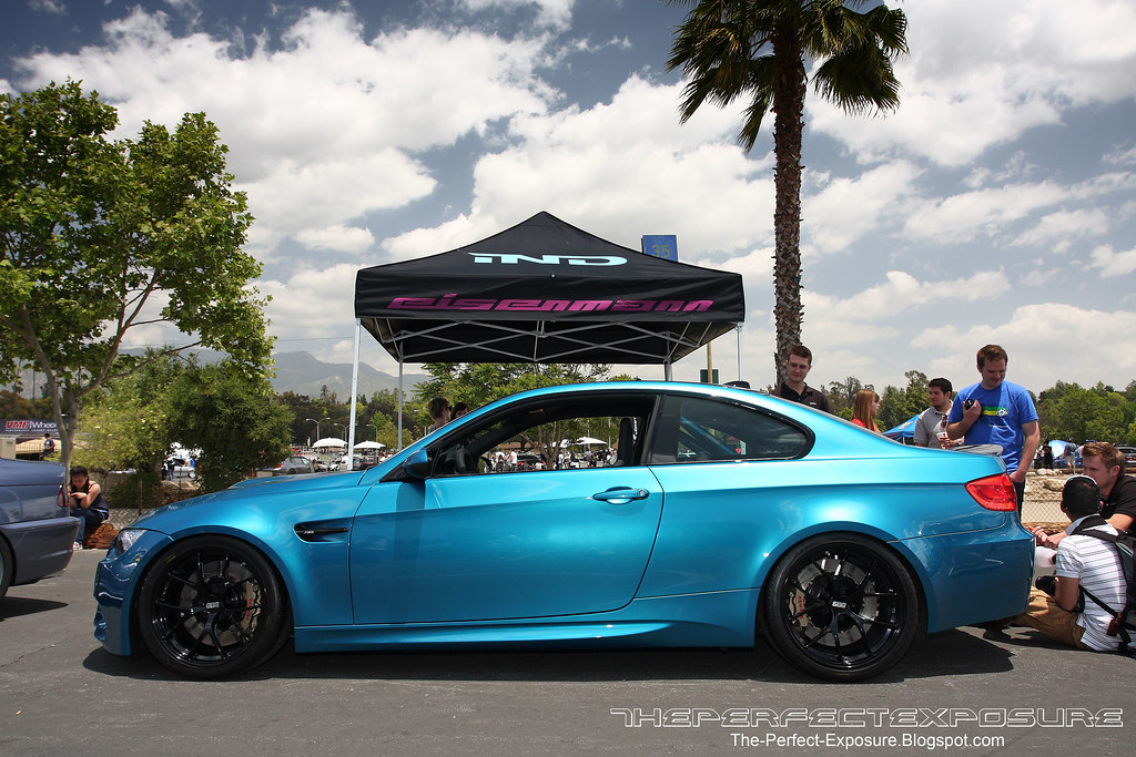
The turquoise one is pure ownage, awesome color scheme.

3 and 9. i just cam a little..

Who even has the cash to mod these rides? lol

