Hey, isn't that Dom's car?
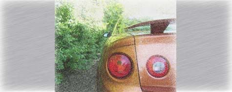
Meh, its cool/badass but its totally ridiculous. Looks like a cheesy action movie car. Plus I HATE satin/flat black. I never liked it and its so played out now, its ridiculous.
 Flickr Photostream Facebook Twitter
God!!! Major boner material. I'd just take off the graphics and darkened headlights and tailights.
Not a fan of anything Chrylser, but damn! That looks bad ass. I don't really see the difference in the body from stock (apparently it's a one off wide body kit), but the red lights and big ass blower are good stuff. Not a fan of the wheels, but again, they suit the car. The only thing that I don't like and I don't think suits the car is the exhaust tips. Something about them just doesn't sit right to me.
2010 Honda Fit LX
I love it OTHER than the graphics....

I think the nostalgic "blower through the hood" is a wonderful throwback. Somewhere along the line, this became passe, as the "clean" look dominated and smooth, boring hoods became the norm.
What's old is new again! Nice work, but yes...the graphics mar the concept. Should have found a less intrusive way to draw in some sponsor bucks!
Bill Hahn Jr.
Hahn RaceCraft

World's Quickest and Fastest Street J-Bodies
Turbocharging GM FWD's since 1988
www.turbosystem.com
Matt mckenna wrote:its cool but i think that style is more suited for the 70's challengers IMO
I was going to make a similar comment yesterday, but held my tongue lol

thats flipping hott
RIP JESSE GERARD.....Youll always be in my thoughts and prayers...


That is a great looking car and kick ass photography.

Who's going to be a good friend and get me this
 I <3 JGM
I think bigfoot is blurry,
that's the problem. It's not the photographer's fault. Bigfoot is blurry. And that's extra
scary to me. There's a large, out-of-focus monster, roaming the countryside.
"Run! He's fuzzy!" "Get outta here!"

In Loving Memory of Phil Martin December 14 2005
I'm not a fan of the photography. I don't mind a few pics done up in that style but I want to see the unaltered photos too.

FORGET GIRLS GONE WILD WE HAVE GOVERNMENT SPENDING GONE WILD!
I think it looks pretty awesome!
Wade Jarvis wrote:I'm not a fan of the photography. I don't mind a few pics done up in that style but I want to see the unaltered photos too.
What is altered on them?

I'm no photography expert but it looks like the saturation was changed or sephia change or most likely a combination of many tuning effects. It is blatantly obvious that is not how picture would look if you were standing there looking at it with your eyes.

FORGET GIRLS GONE WILD WE HAVE GOVERNMENT SPENDING GONE WILD!
If I had to guess I would say they used a high dynamic range shot, with an emphasis on detail. They probably also emphasized the red color curves and put a little less emphasis on the green color curves. Doing this would really make the car pop!


